Designed the new online checkout experience for CVS customers refilling medications, unifying multiple lines of business for cart, checkout, and confirmation for web. Delivered updated responsive front-end designs to integrate seamlessly with legacy back-end calls and APIs. Collaborated with other design teams to deliver a consistent end-to-end experience.
For legal and informational purposes, please be advised that all designs, branding elements, and research materials referenced herein have undergone necessary coverage and modifications. Presently, all designs and user flows are in active development and production stages. None of the aforementioned designs or user flows have been officially launched to the market. The information provided herein is intended to convey the ongoing development status and does not indicate the availability or release of any products or services.
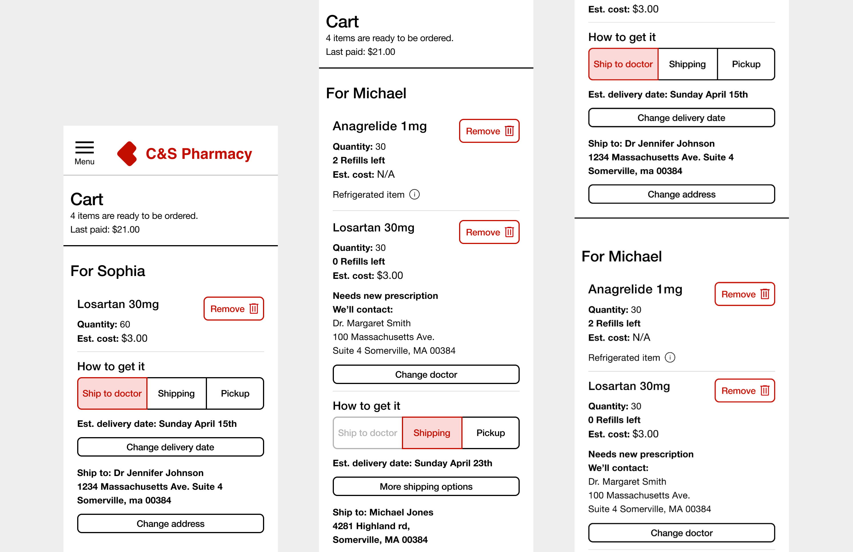
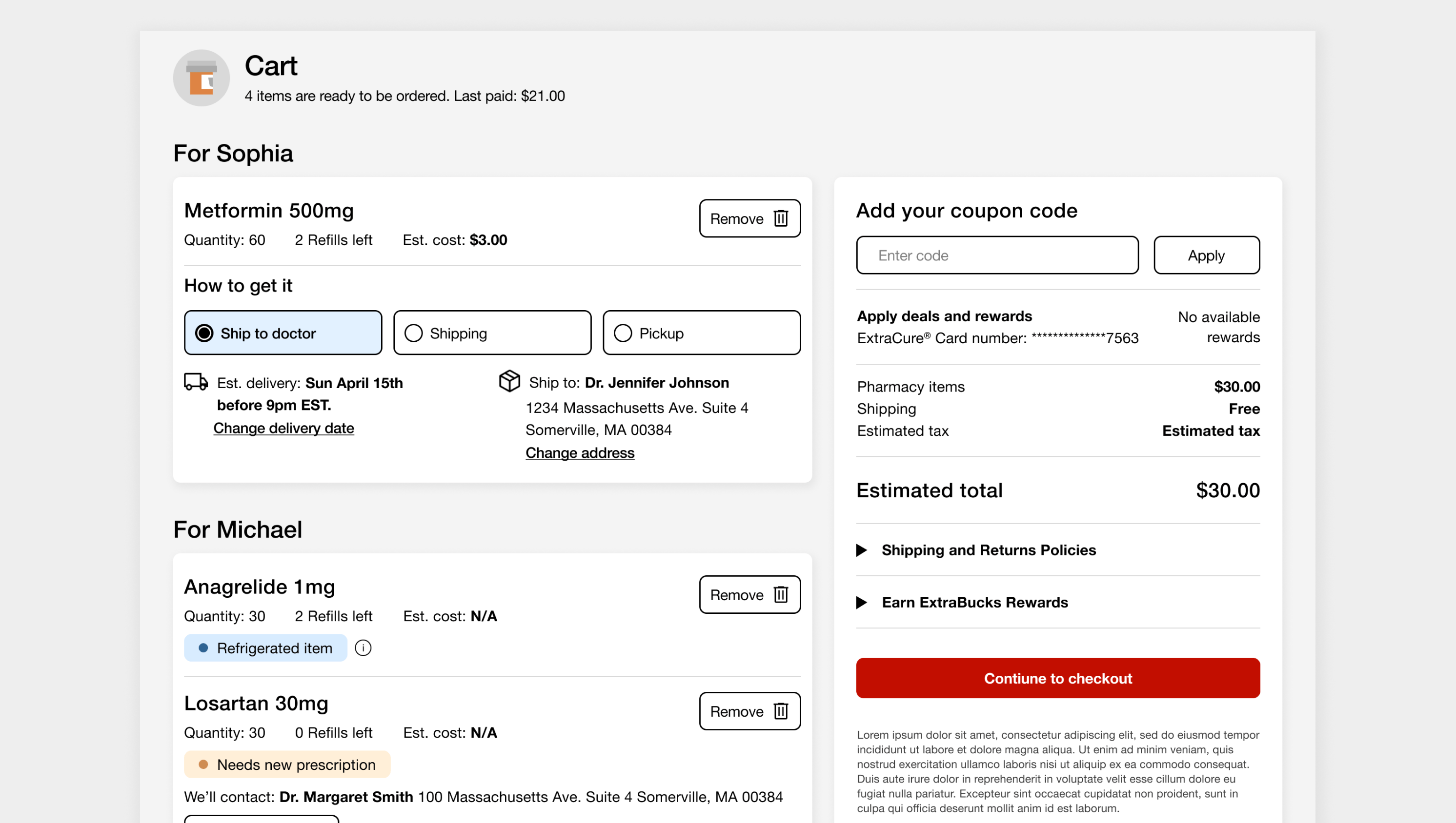
The objective was to consolidate checkout experiences from CVS’s different LOB. Customers want a checkout experience that collects all their items from across CVS's platforms into one convenient spot. Throughout the customer journey, there are multiple entry points, and customers should seamlessly access a unified experience without knowing which LOB they are interacting with.
Cross-functional collaboration process
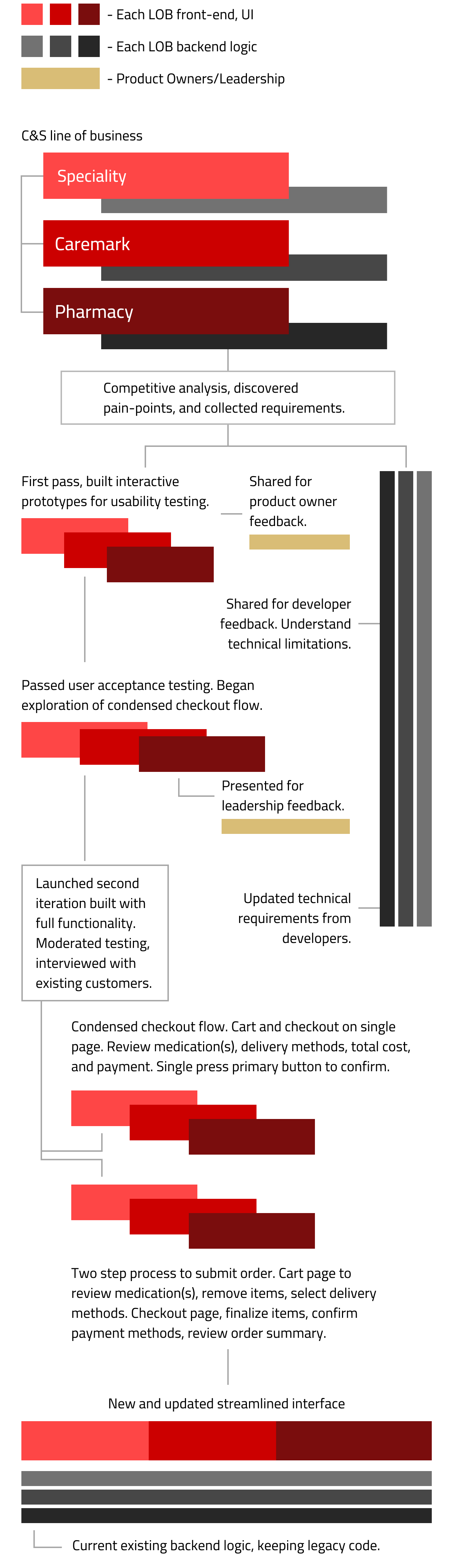
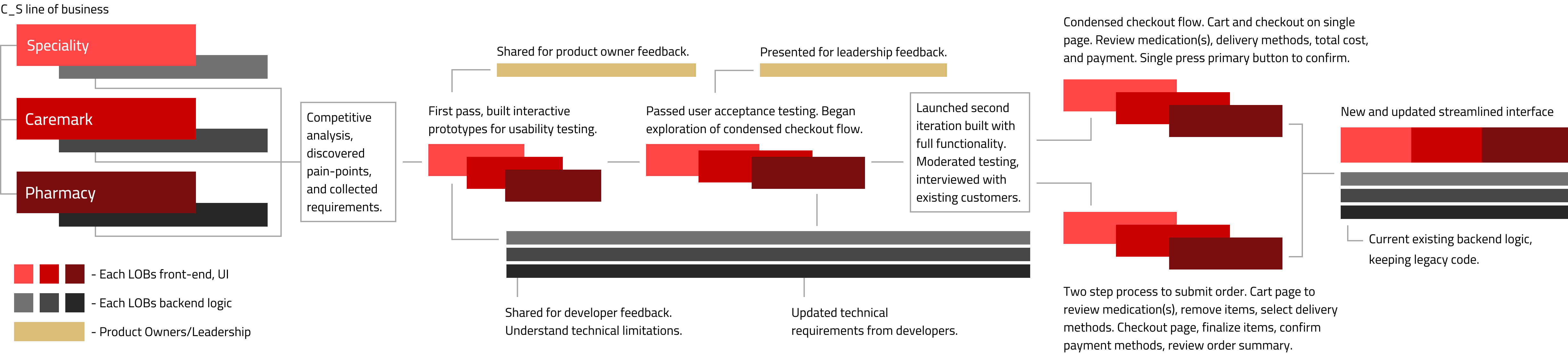
Utilized existing legacy backend calls and APIs, working closely with cross-functional teams. Shared designs, collected feedback, and gathered suggestions. Collaborated with technical experts to identify technical constraints. Consolidated the checkout process, allowing customers to order from different lines of business through a unified interface.
After competitive analysis and discovery work, low-fi wireframes were created to fully understand the scope of work and different use cases. From simple cart, complex orders, to mixed medications. Different designs were produced with full functionality for testing, looking for any additional pain-points or confusion.
User-testing Prototypes
Usability testing results
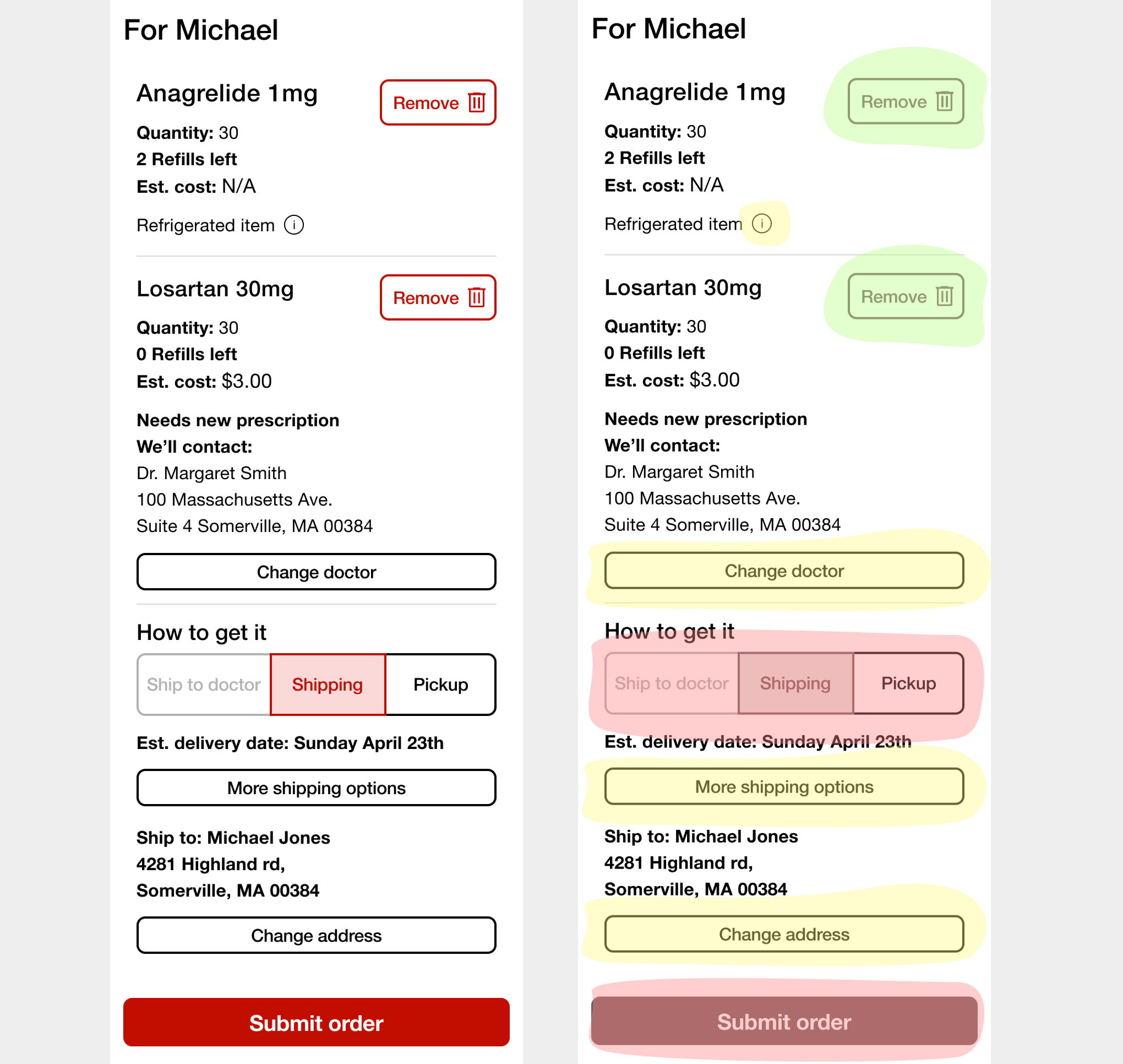
Interactive elements would make users conflicted on hierarchy of information in the mobile view. Yellow touch-points, though optional, conflicted with the required red touch-points, creating consistency issues and user stress. Some users noted size of remove button being too obvious, leading to accidental deletion of items. While usuable, clear distractions for users.
User research and feedback


Cross-functional research readout: working sessions and techincal component audit
To ensure alignment among cross-functional teams, established an open culture of feedback within the team early on. Seeked input from developers and product teams regarding design ideas and was receptive to their suggestions. Multiple working sessions and found creative solutions to overcome any techical requirements that best served the customers.
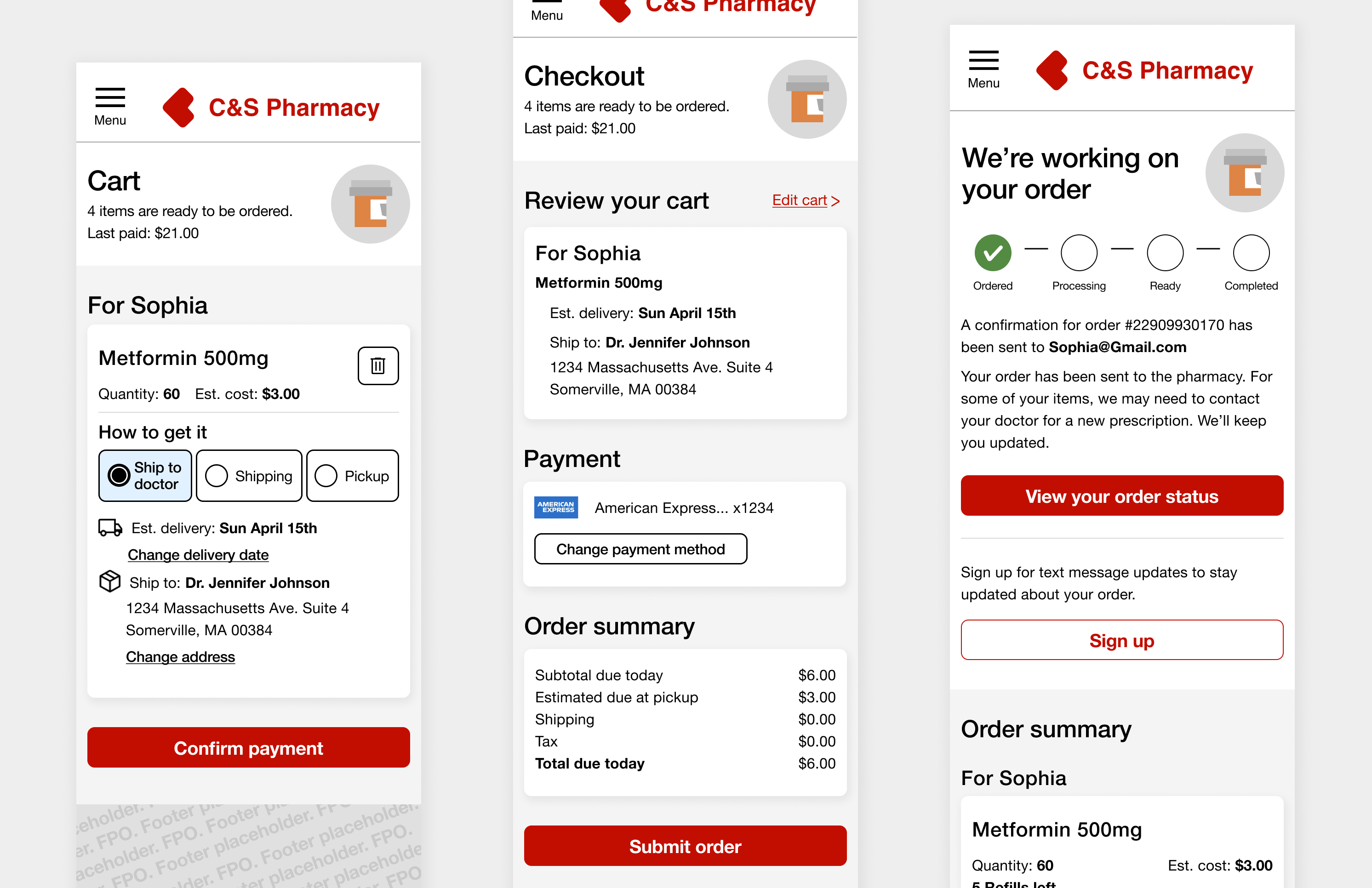
Refinement, new cart page designs
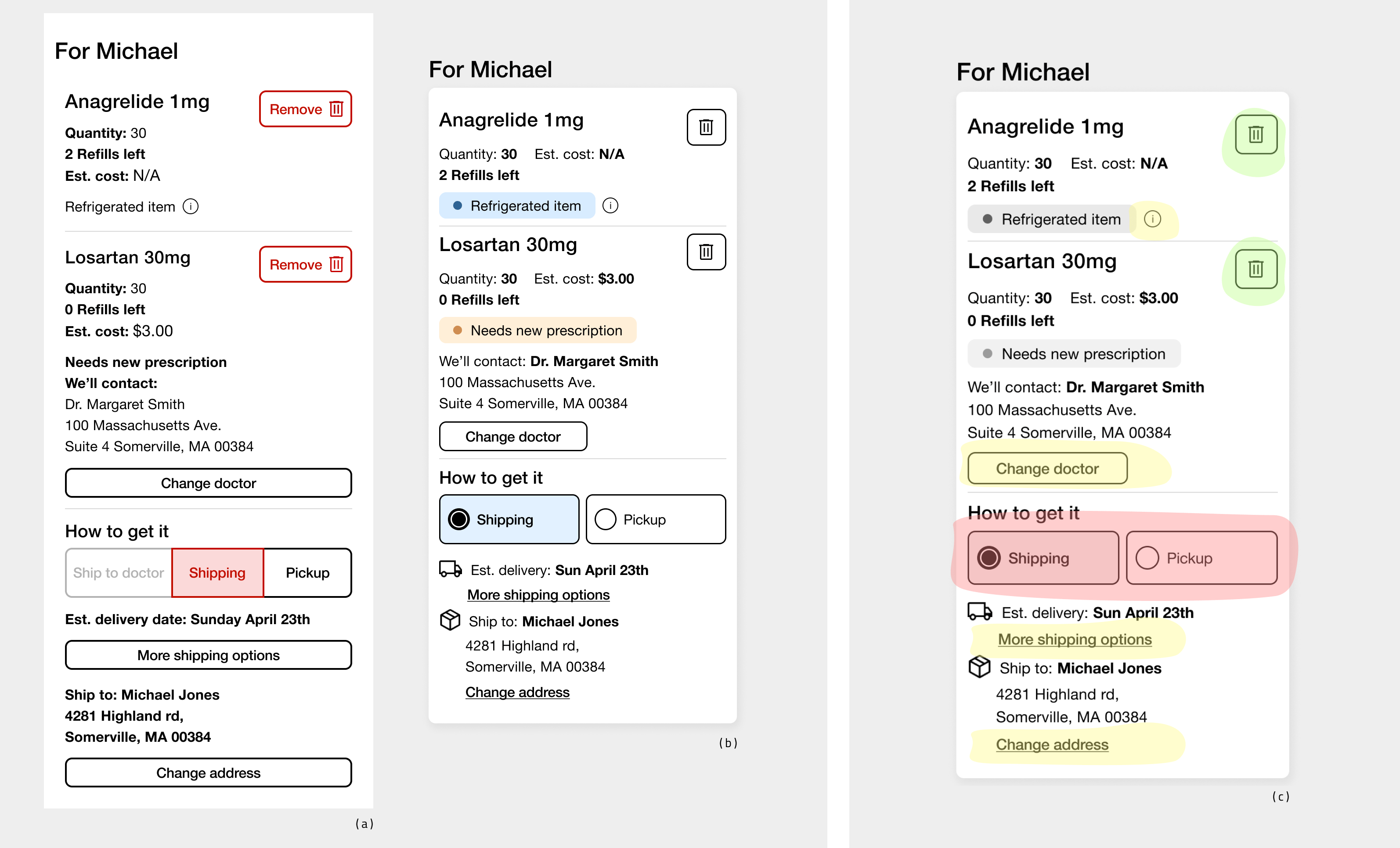
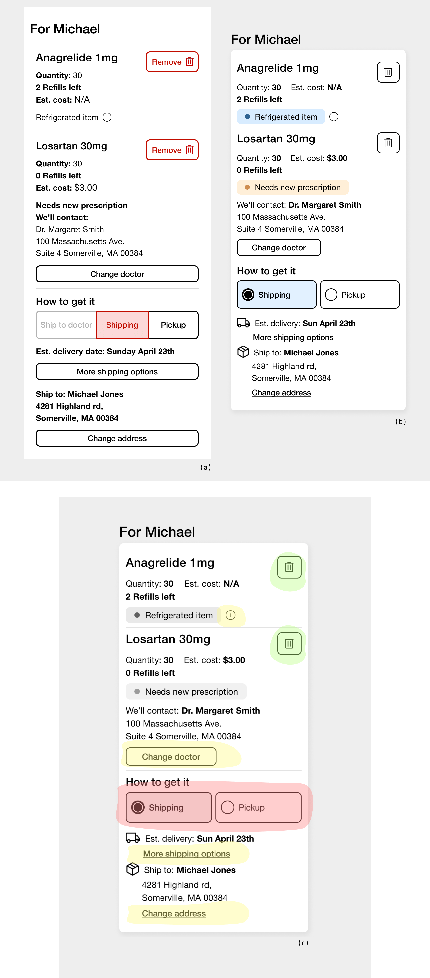
In this new iteration (b), I incorporated user feedback, removed disabled delivery options, refined touch-points (c), and placed a stronger emphasis on critical customer information. This strategic approach reduced clutter and offered customers a more refined experience, achieved through the use of clear interactive elements like links, buttons, and well-utilized white space. It was essential to be selective, especially when considering the mobile viewport and ensuring accessibility.
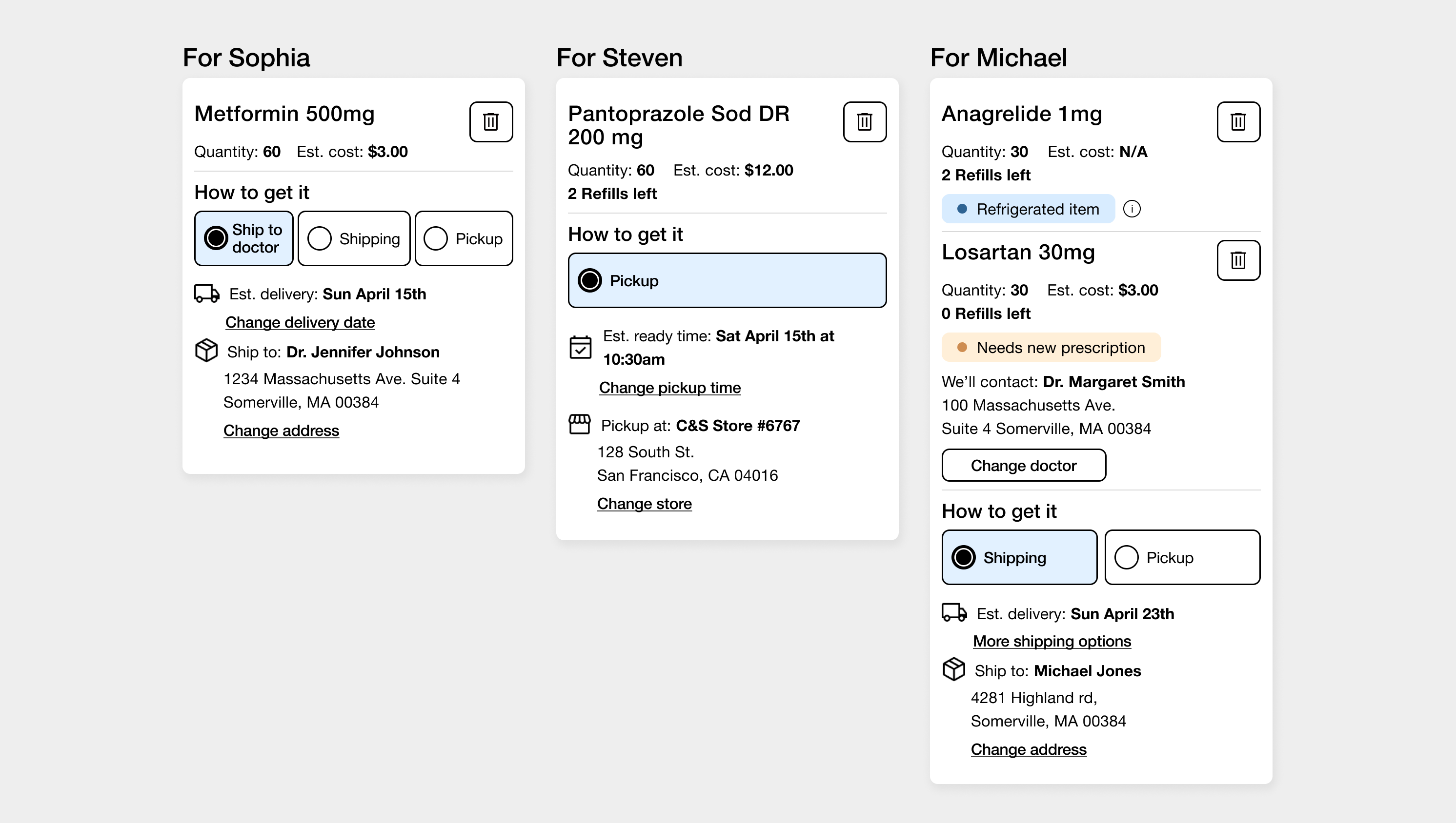
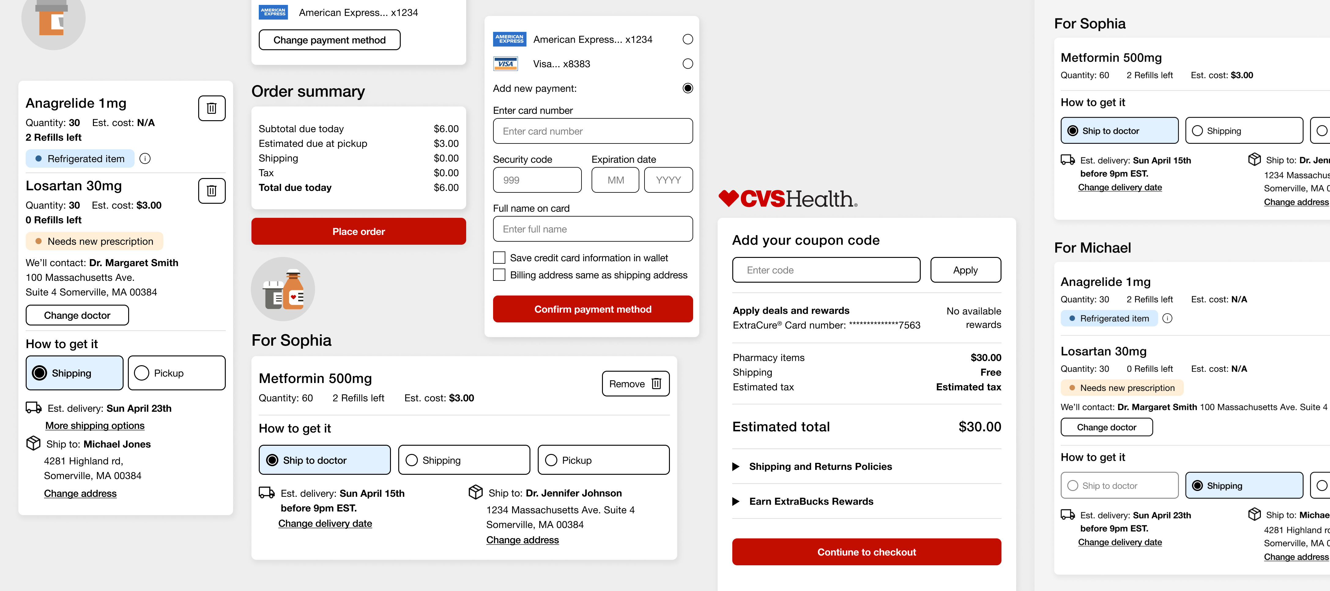
Data architecture sorted medications by patient names and avaiable delivery methods based on added cart itmes. In the mobile view, removing unavailable delivery methods and consolidating the medication's value pairs (quantity, cost, etc.) saved screen space. Reduced height by 18% compared to the intial design wireframes used in usability testing.
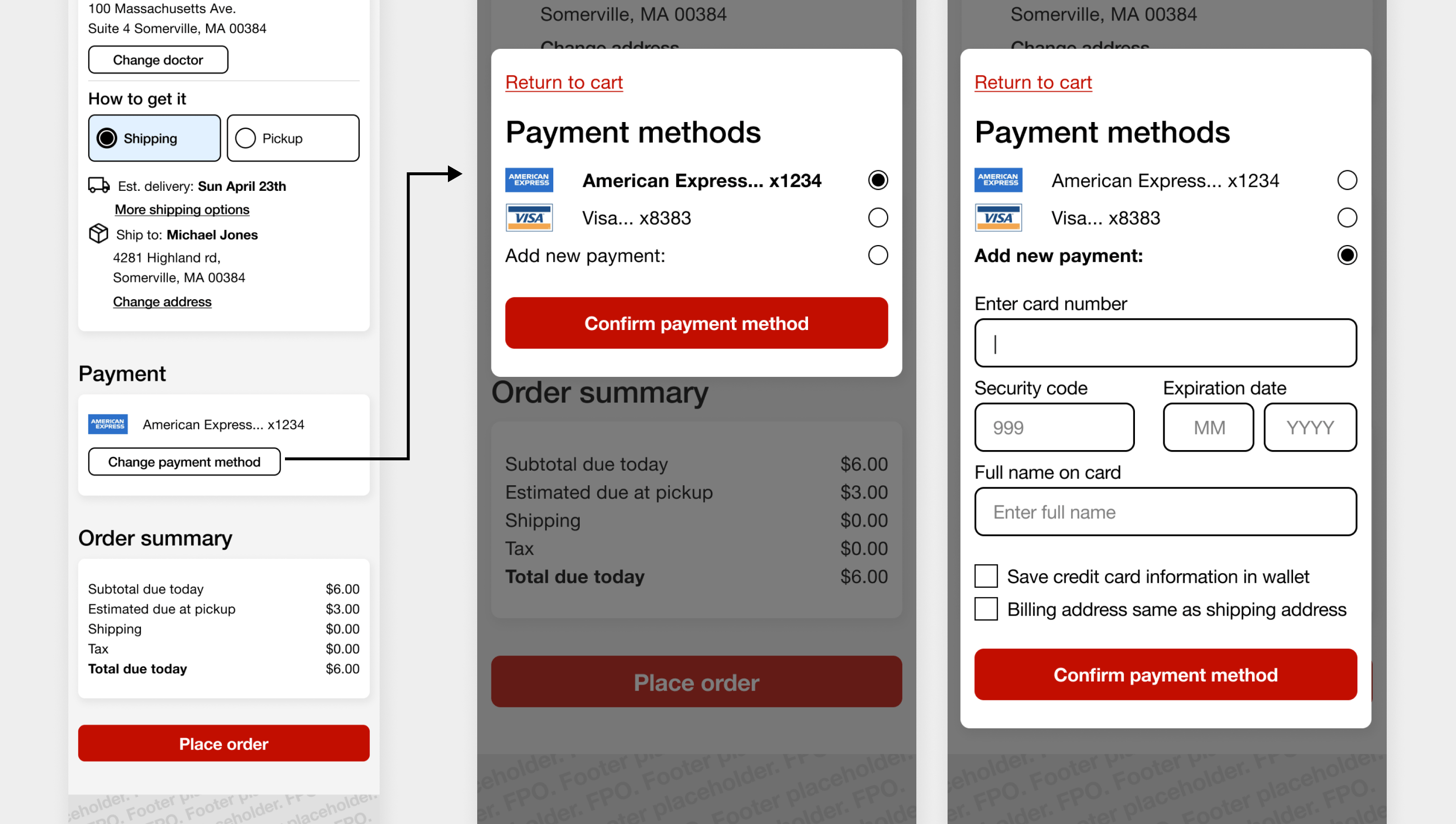
I designed a payment functionality that was connected to the customer's account. Depending on the login and entry point, the default payment method was automatically loaded. In the case of customers with multiple medications from different LOB, the backend system pre-loaded the user's default payment method based on the first medication added to the cart.
Desktop explorations
Consolidated checkout - user testing
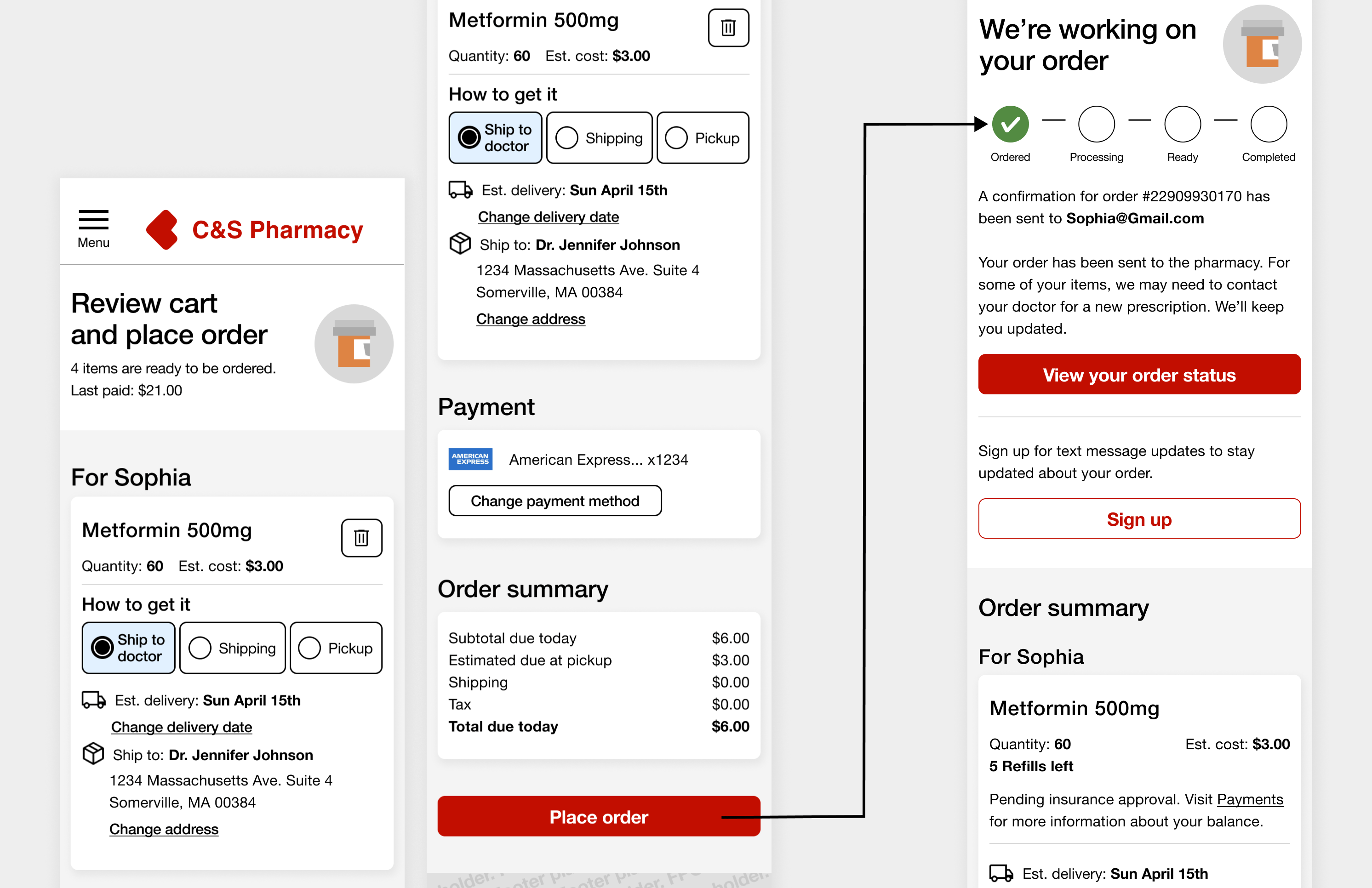
Additional exploration was conducted for the checkout flow. A consolidated checkout experience was aimed for, with the goal of facilitating faster transactions and providing a robust customer experience with a wide range of built-in functionalities. The original checkout experience consisted of three main steps excluding sad paths: cart management, checkout screen, and order confirmation. The primary focus was on ensuring a consistent checkout experience through seamless integrations and enhanced efficiency.
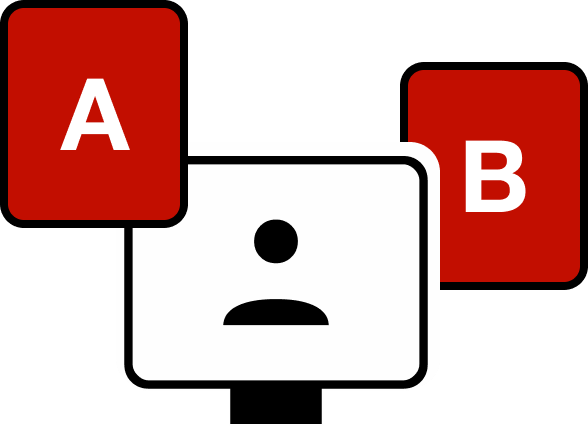
In the initial round of testing, participants first evaluated design A, followed by design B. This involved moderated testing sessions with follow-up questions covering task difficulty and satisfaction levels. Subsequently, I conducted A/B testing for customers to assess both experiences.
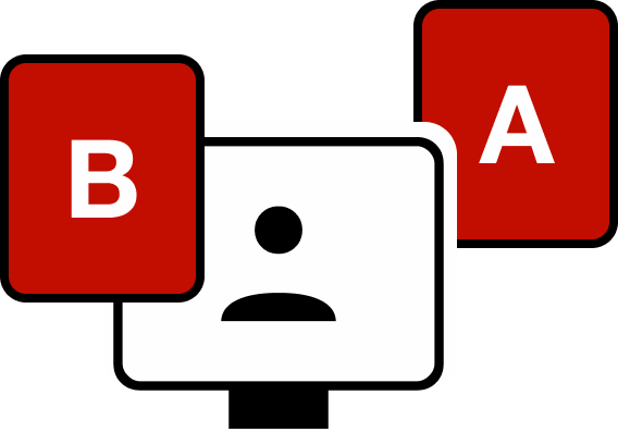
To mitigate any potential first impression biases, we conducted an additional round of testing with participants, beginning with design B and then proceeding to design A. This approach allowed us to gather unaltered, unbiased customer insights. All moderated testing sessions utilized the same set of questions, but with the order reversed.
Three steps: cart, checkout, and confirmation
Two steps: cart checkout and confirmation